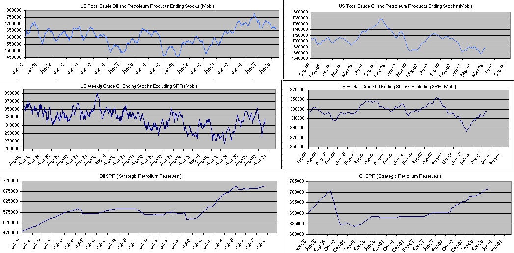
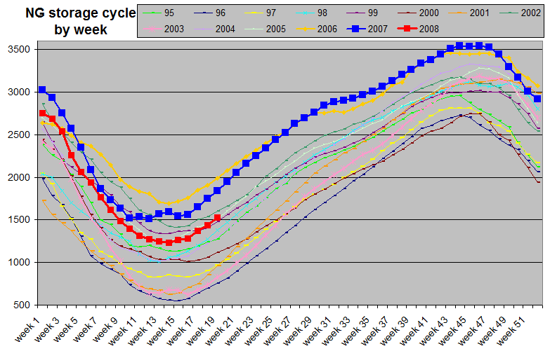
Back to Main Page weekly INDEX CHARTS UPDATED ON WEEKENDS
I mainly use Andrews Pitch forks but when trend lines are used....Yellow lines are resistance, Red lines are Supports. Dashed is weaker than solid. The curved Yellow lines are the 200 DMA. Thin Red and Thin Green lines are the 15 day EMA and 5 Day EMA respectively. ( Thanks Mrs. Wolf) - Green over red, bullish, Red over Green bearish. --
Regression channels are also used. General rule of thumb for forks and regression channels are that light blue is shorter term, Dark Blue is longer term with better history ( months to years). When conflicting channels or forks are shown, I try to use Green for bullish alternatives and red for bearish alternatives. Other colors are sometimes used but mainly for contrast and not uniform for duration clues.
Red and Green Arrows are SELL and BUY Signals respectively. Chances are usually good for a bottom or top when these signals fire. NOTHING is fool proof so use stop losses and use your own judgement but I almost always sell a RED arrow and Cover shorts on a Green Arrow and will often enter a new trade on these signals, especially if it is near a trend line or a candle stick formation that matches what the signal is predicting. The Blue diamond/dots are class over bought and class over sold signals and can mean either tighten stops on existing positions or possible entry points for new positions. These are used in conjunction with trend lines etc. They often just signal exit points indicating sideways action which eats up premium on options which is all I trade. They are highly reliable in this regard however using them to time entries into new postions is harder. These signals are not anything fancy and mostly weighted mixes of cyclical indicators unlike the more complex "Arrow Signals". The closest thing I can equate it to would be a poor attempt at Don's class signals.
In the MACD window, the red lines are MACD and the Blue line if still there, is a +1/-1 MACD divergence signal meaning +1 is in sync,-1 is MACD divergence. I stopped using this indicator for the most part but some charts may still have it on there. The CMO reading in this window is short term 4 day and a 6 day stochastic. In the top window is stochastic both short term 12 day which is red, and the darkgreen which is long term stochastic. Again, though I stopped using it for the most part, some charts may still have the 14 day CMO as a dark yellow line. I added these to let people see more information on my signals, without my having to write on each chart every night like I used to as I went from posting 5 charts to 25 to 50 to over a hundred every night.
PLEASE - PLEASE - PLEASE, do your own DD, and trade only according to your own experience and risk tolerance. These signals are an automated formula driven system and are not fool proof. They work great on some stocks and indexes and fail miserably on others. These are not trade recomendations and are simply a way for me to share with others what I am seeing. Do I trade off of them, YES. I also weigh Fundamentals, news and my own experience and instincts. My time frame, risk tolerance and other factors may not be the same as yours.
I also am VERY busy with other things in life like full time military employment, Night College, family etc. I may not update these charts at all if I get busy. Again, PLEASE do your own Due diligence and use these charts at your own peril!!
